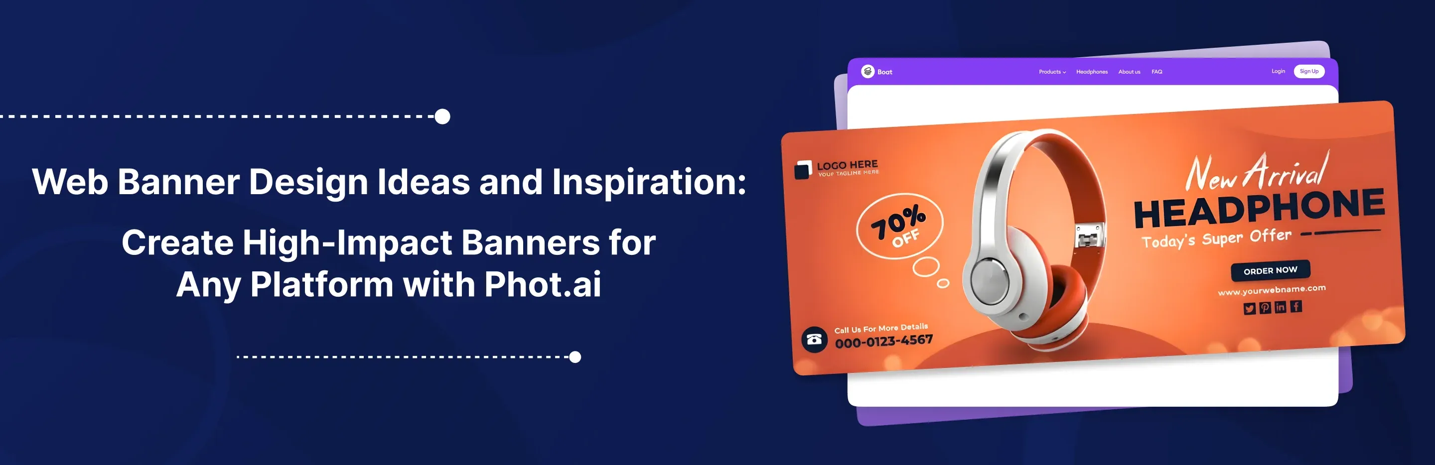
Web Banner Design Ideas and Inspiration: Create High-Impact Banners for Any Platform with Phot.ai
Complete Web Banner Design Guide 2025: Sizes, Templates, and AI Tools for Homepage Hero Banners, Display Ads, and Social Media
16th Dec, 2025
Why Banners Define Your Digital First Impression
Your banner is your brand's handshake, and most users decide whether to stay or scroll within 3 seconds.
Think about it. When someone lands on your website or scrolls past your ad, the banner is the first thing they see. It's not just decoration. It's a silent salesman that either pulls visitors deeper into your brand story or sends them clicking away to a competitor.
The problem? Most web banners fail. They're visually flat, poorly sized for mobile, or crammed with so much text that the message gets lost. I've reviewed thousands of campaigns, and the pattern is clear: amateur banners lose conversions before the visitor even reads a word.
This guide breaks down everything about web banners—from types and design inspiration to exact steps for creating professional website banners and social media headers in minutes using Phot.ai. Whether you're building a homepage hero banner, launching a display ad campaign, or refreshing your social media presence, you'll walk away with actionable web banner design ideas and the tools to execute them beautifully.
Phot.ai is an AI banner design assistant that helps users go from idea to finished creative instantly — no Photoshop degree required, no hours wasted resizing assets.
What Is a Web Banner and Why It Matters in 2025
Defining the Web Banner
A web banner is the hero image, promotional strip, or ad creative displayed on a website or digital platform. It's the visual anchor of a page — designed to communicate your message, showcase products, or drive specific actions like sign-ups or purchases.
Let me clarify some common confusion:
Banner vs Banner Ad: A banner is any large visual element on a website (like a homepage hero). A banner ad is specifically a paid advertisement displayed on third-party sites.
Header Banner: This sits at the very top of your site and typically includes branding, navigation, or a key announcement.
Hero Banner: The main visual "billboard" on your homepage — usually full-width and designed to make an immediate impact.
Why Banners Matter More Than Ever
Banners aren't just pretty pictures. They're strategic assets that influence:
First impressions: Eye-tracking studies show visitors scan your banner within 50 milliseconds of page load.
Click-through rates: Well-designed banner ads can achieve CTRs 3-5x higher than text-only promotions.
SEO and UX: Google's Core Web Vitals now factor in visual stability and load time — poorly optimized banner images hurt your rankings.
Common questions people search for:
What is a banner on a website? It's the primary visual element that sets the tone and communicates your core message.
What is a website banner? A large-format image or graphic element used for branding, promotion, or navigation.
Why would you include a banner on your website? To capture attention, establish brand identity, communicate offers, and guide user behavior.
In my experience working with e-commerce brands and SaaS companies, the difference between a converting homepage and a bouncing one often comes down to the banner. And with Phot.ai, you can create all banner types — from website headers to social media covers — with consistent branding in just minutes.
Types of Web Banners With Real Examples
Understanding banner types helps you choose the right format for your goal. Let's break this into two categories: website banners and banner ads.
Website Banners
1. Homepage Banner (Hero Banner)
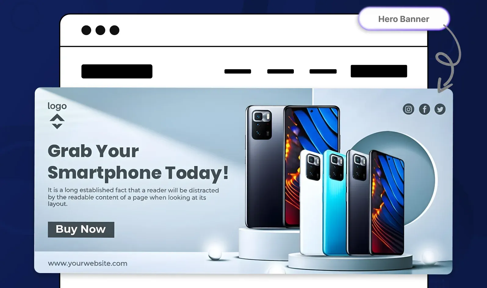
This is your digital billboard — the first thing visitors see. It typically spans the full width of your site and communicates your primary value proposition.
Example use case: A fashion brand showcasing their new spring collection with a large product photo, headline "New Arrivals," and a "Shop Now" CTA.
2. Header Banner
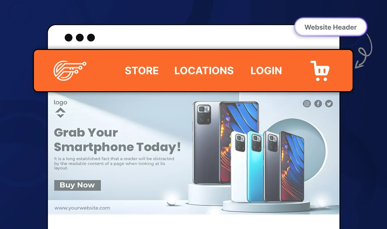
Located at the very top of your pages, this banner reinforces branding and identity across your site. It's more subtle than a hero banner.
Example use case: A SaaS company displaying their logo, tagline, and trust badges in a clean, minimal header.
3. Promotional Banner

These announce sales, limited-time offers, or seasonal events. They're usually positioned prominently and use urgent language.
Example use case: "Black Friday Sale — 40% Off Everything | Ends Monday" with a countdown timer.
4. Sidebar Banner (Skyscraper)
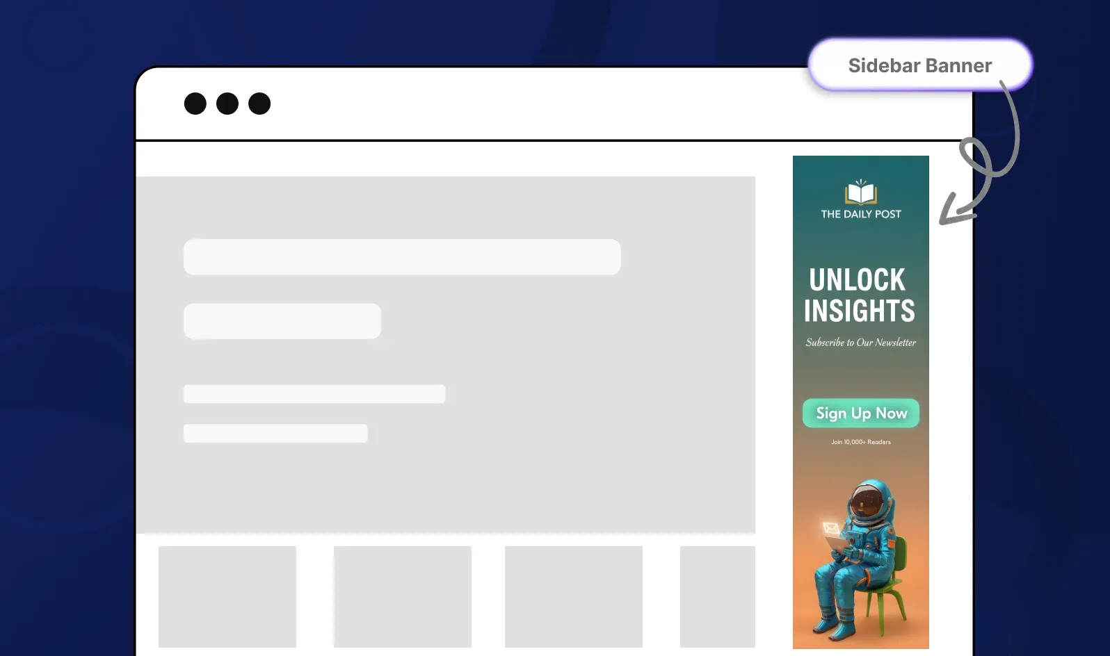
Vertical banners that run alongside your main content — often used for navigation, ads, or highlighting secondary content.
Example use case: A blog featuring a tall banner promoting a newsletter sign-up.
5. Footer Banners
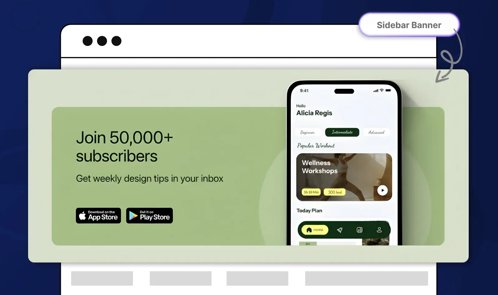
Subtle banners at the bottom of pages, great for email captures or cross-selling products without disrupting the main experience.
Example use case: "Join 50,000+ subscribers — Get weekly design tips in your inbox."
Banner Ads (Display Banners)
These are the paid advertisements you see across the web, from Google Display Network to social media placements.
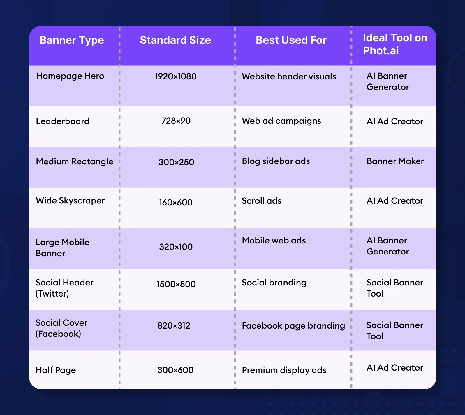
1. Leaderboard Ad (728×90)

The classic horizontal banner at the top of web pages.
2. Medium Rectangle (300×250)
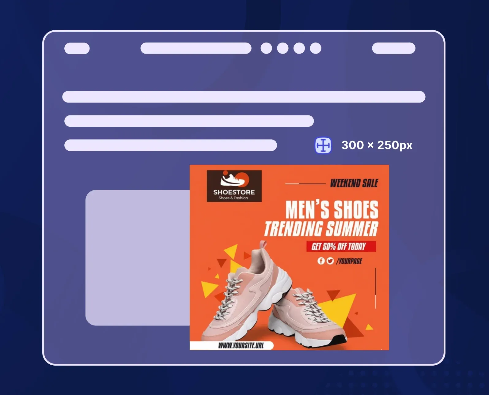
The most common display ad size — fits in sidebars and within content.
3. Wide Skyscraper (160×600)
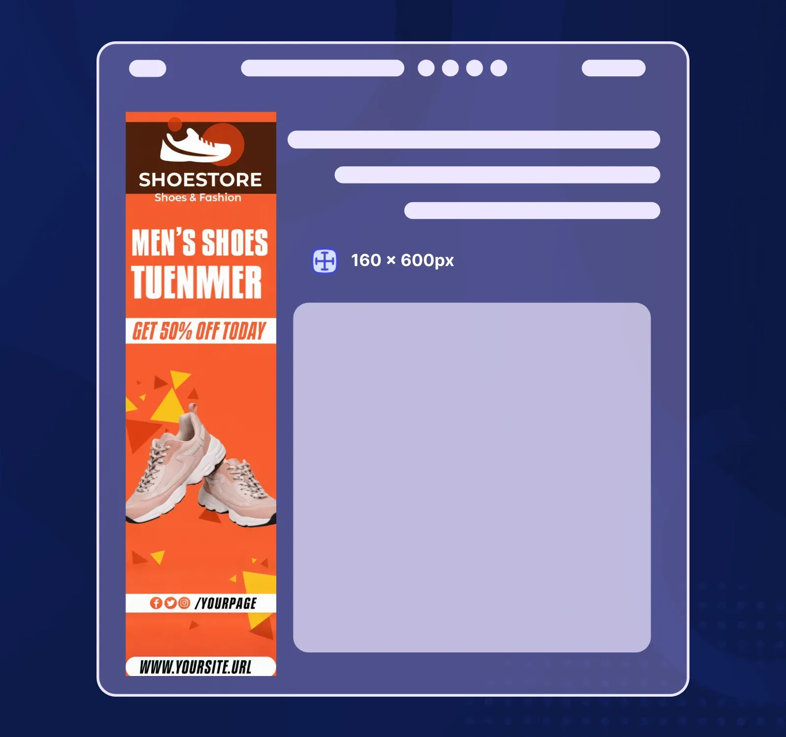
A vertical format perfect for sidebar placements on blogs and news sites.
4. Large Mobile Banner (320×100)
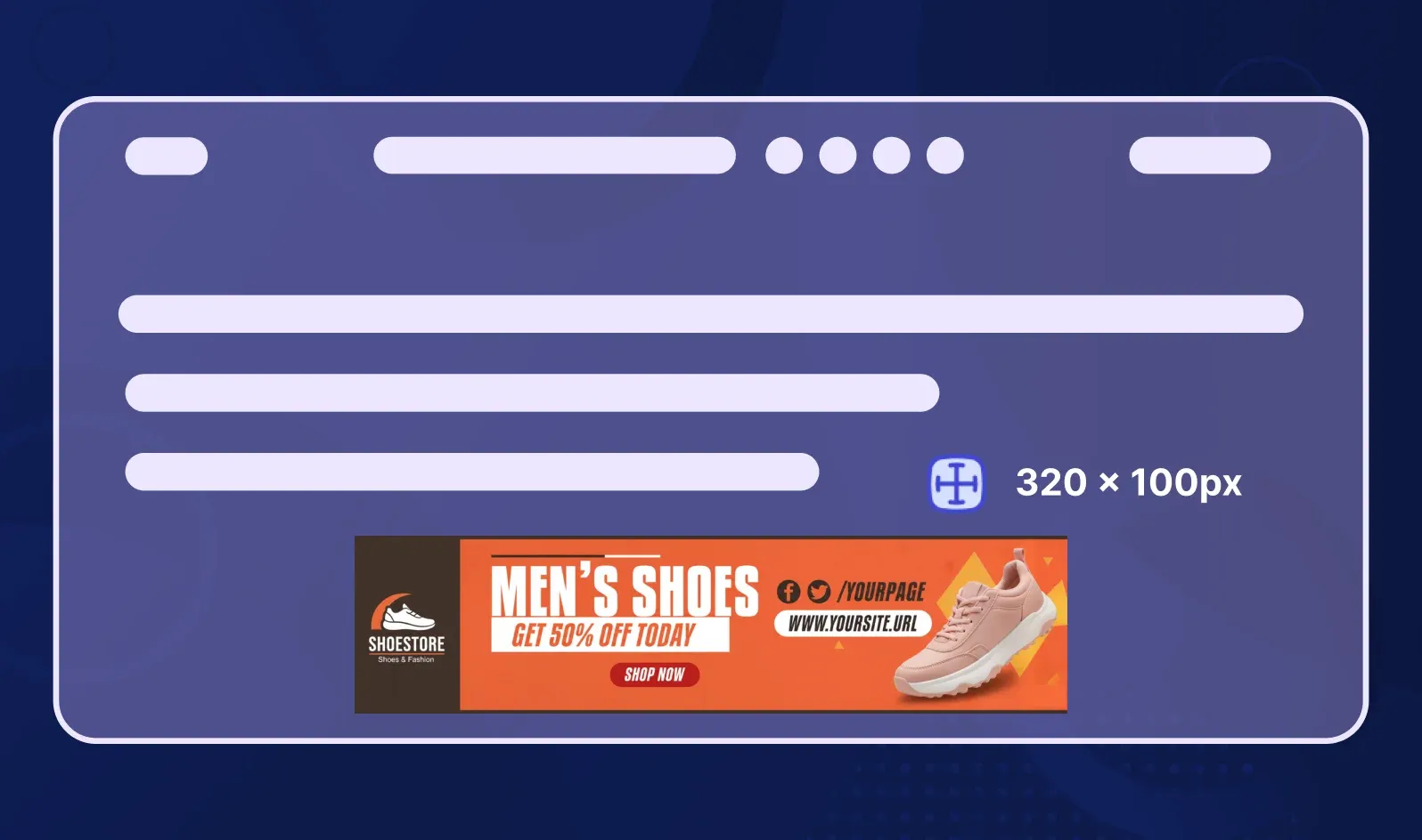
Optimized for mobile screens where vertical space is premium.
5. Half Page Ad (300×600)
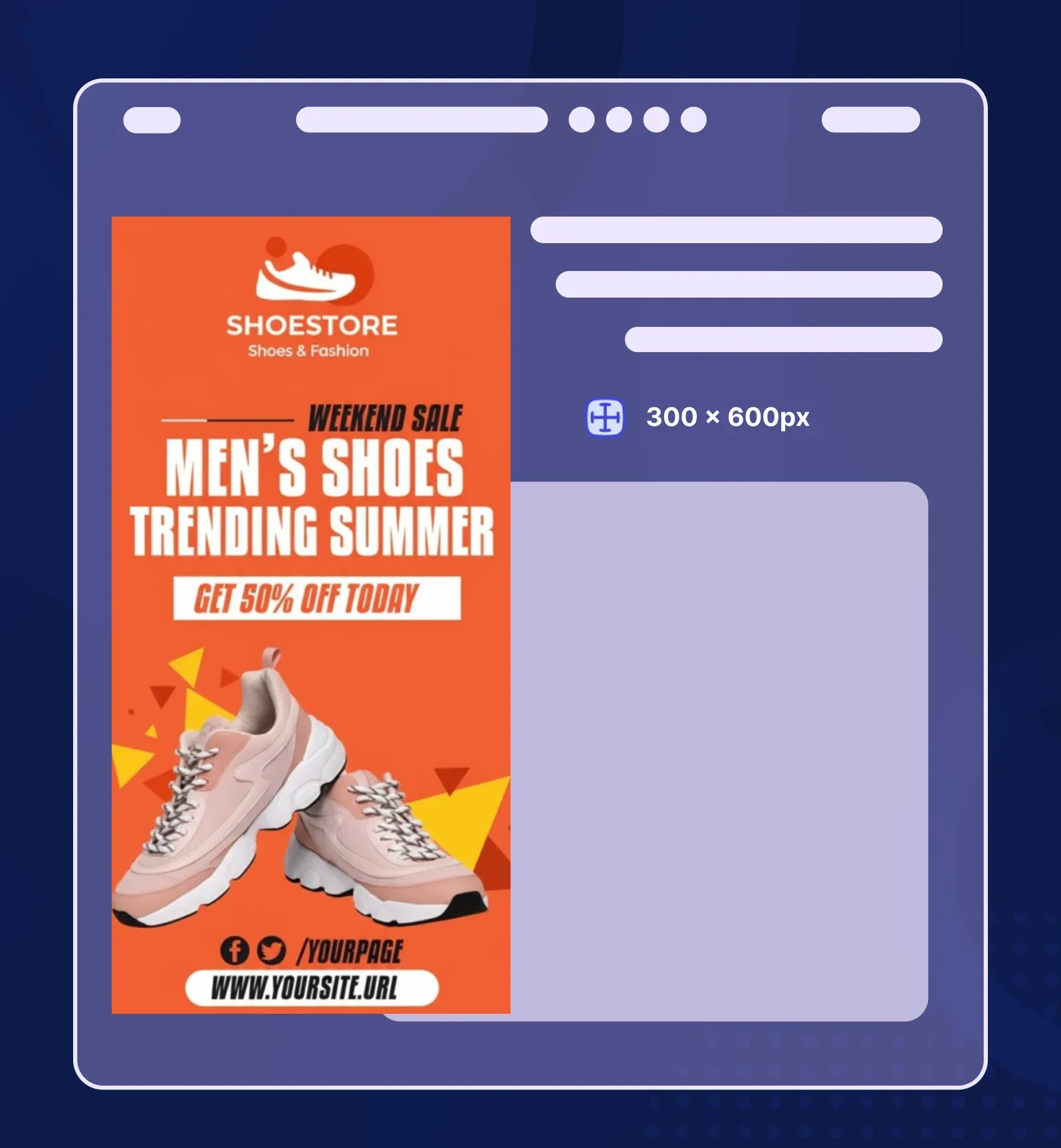
A larger vertical format that commands attention without being intrusive.
Banner Size and Use Case Reference
Understanding these types of banners helps you create the right asset for the right platform — and with Phot.ai's AI-powered templates, every size and format is just one click away.
What Makes a Great Web Banner?
I've spent years testing banner designs across industries, and the difference between a scroll-past and a click-through always comes down to a few core principles.
1. Clarity Over Clutter
One clear visual idea per banner. The moment you try to communicate three different messages, you communicate none of them. Your viewer should understand your banner in under 2 seconds.
Bad example: A banner with a product image, three different fonts, four CTAs, and a background pattern.
Good example: clean white space, one hero product photo, a single headline, and one CTA button.
2. Visual Hierarchy
Guide the eye with intentional design. The reading pattern should always be: Headline → Image → CTA.
Use size, contrast, and positioning to create this flow. Your headline should be the biggest text element. Your CTA should be the most contrasting color.
3. Color Psychology
Colors trigger emotional responses, and smart banner designers use this:
-
Blue = Trust, professionalism (banks, tech companies)
-
Red = Urgency, excitement (sales, clearance events)
-
Yellow = Optimism, warmth (creative brands, food)
-
Green = Growth, health (wellness, sustainability)
-
Black = Luxury, sophistication (high-end fashion)
4. Whitespace Is Your Friend
Negative space improves readability and focus. Cramming every pixel with content overwhelms the viewer. I always design with 20-30% whitespace minimum.
5. Motion and Emotion
Subtle animation (like a gentle fade or parallax scroll) increases banner recall by 40%. Human faces and emotion-driven imagery also boost engagement — we're wired to pay attention to people.
6. Mobile Optimization
Over 60% of web traffic is mobile. If your banner looks great on desktop but unreadable on a phone, you're losing more than half your audience.
Mobile banner checklist:
-
Text size 16px minimum
-
Single-column layout
-
Large, thumb-friendly CTA buttons
-
Fast-loading images (under 200KB)
Here's where Phot.ai becomes your secret weapon: The AI design engine automatically suggests color palettes, layout balance, and spacing based on aesthetic scoring. It detects when your text is too small, when your contrast is weak, or when your composition feels off-balance — ensuring every banner is conversion-ready before you even export it.
Step-by-Step: How to Make a Web Banner Using Phot.ai
I create banners almost daily for client campaigns, and since switching to Phot.ai, my workflow has gone from 2 hours to 10 minutes. Here's exactly how I do it.
Step 1: Define Your Goal

Before I touch any design tool, I ask: What is this banner supposed to do?
-
Drive clicks to a product page?
-
Build brand awareness?
-
Capture email sign-ups?
-
Announce a sale?
I open Phot.ai and choose whether I'm making a website header, a web ad, or a social banner. The platform organizes templates by intent, so I'm never starting from a blank canvas.
Step 2: Select a Smart Template
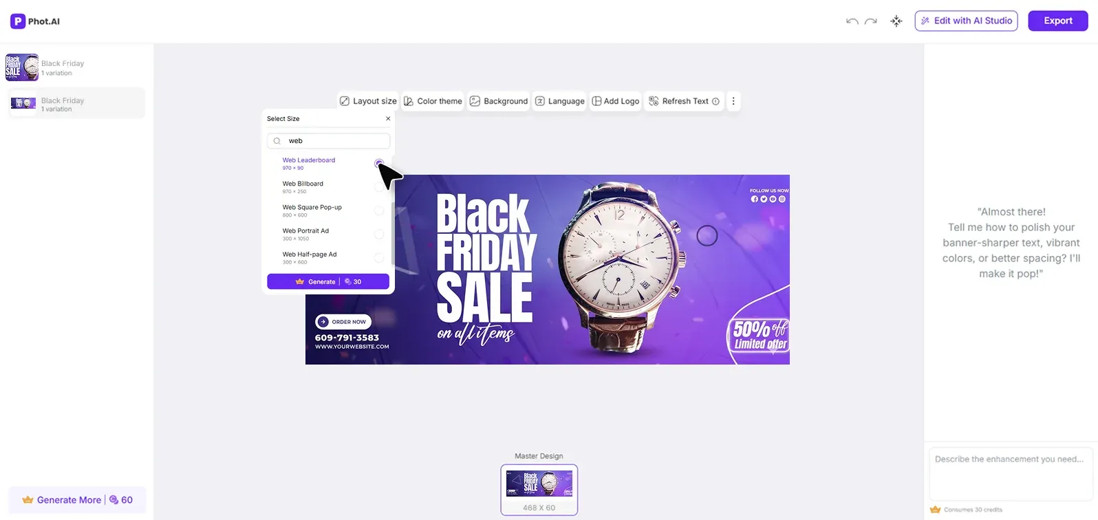
I use the AI Banner Generator — it instantly gives me size-perfect layouts for website banners, ads, and social headers. No more manual resizing or guessing dimensions.
The AI templates are designed with conversion psychology baked in: proper text hierarchy, CTA placement, and whitespace ratios that perform.
Step 3: Upload Brand Elements
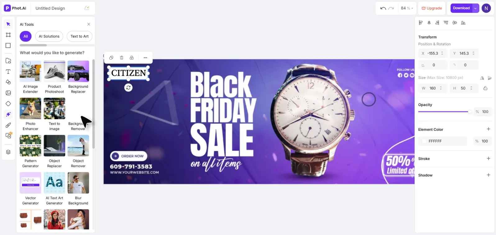
I upload my product photo or logo. If the background is messy or inconsistent, I use Phot.ai's Background Remover to get a clean cutout instantly. This used to require Photoshop and 20 minutes of masking — now it's done in 3 seconds.
Step 4: Customize the Visuals
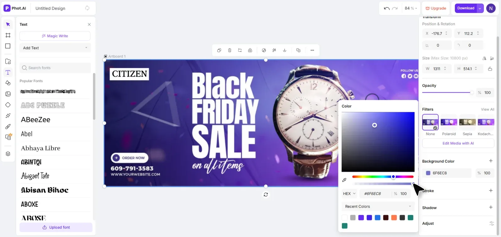
This is where the magic happens. I experiment with:
-
Background colors and gradients
-
Typography combinations (Phot.ai's AI recommends font pairings that maximize readability)
-
Image filters and enhancements
-
Layout adjustments
The AI gives real-time feedback: "Your headline text may be hard to read on this background" or "Consider increasing CTA button size for mobile users."
Step 5: Add CTA and Export
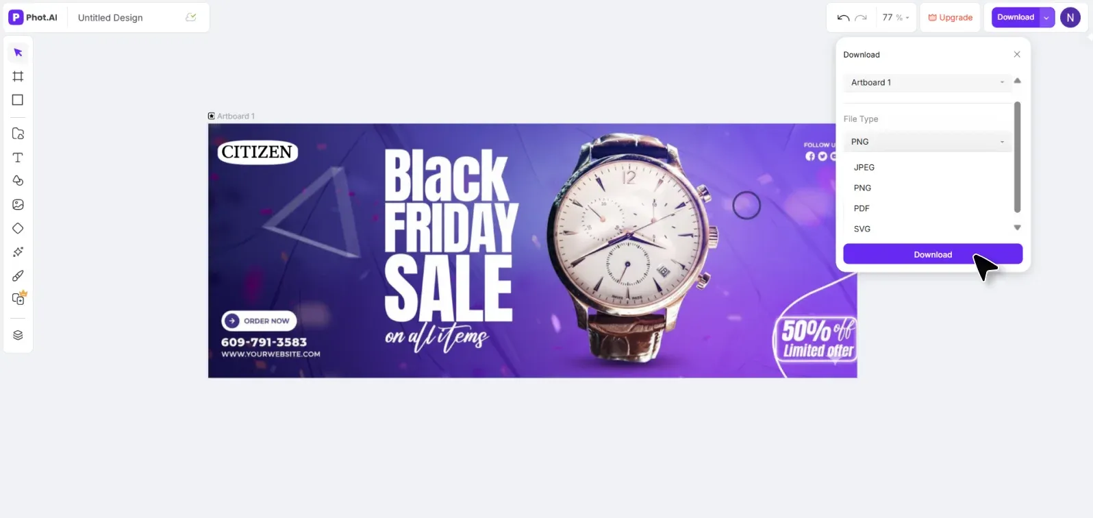
I include a short, clear CTA — "Shop Now," "Learn More," "Get Started," or "Subscribe." Then I export it in the ideal format: JPG for photos, PNG for transparency, or HTML5 for animated display ads.
One more step I always take: I generate 3 banner variants in different color schemes or with different CTAs, then run a quick A/B test to find the highest-performing design.
💡 Pro Tip: Don't fall in love with your first design. In my experience, the banner I think will win rarely does. Create variations and let data decide. Phot.ai makes this fast — you can generate and export 5 versions in the time it used to take to finish one.
Web Banner Design Ideas With Visual Inspiration
Need inspiration? Here are proven banner concepts that work across platforms, organized by use case.
Website Banner Ideas
1. Modern Minimalist Hero Banners
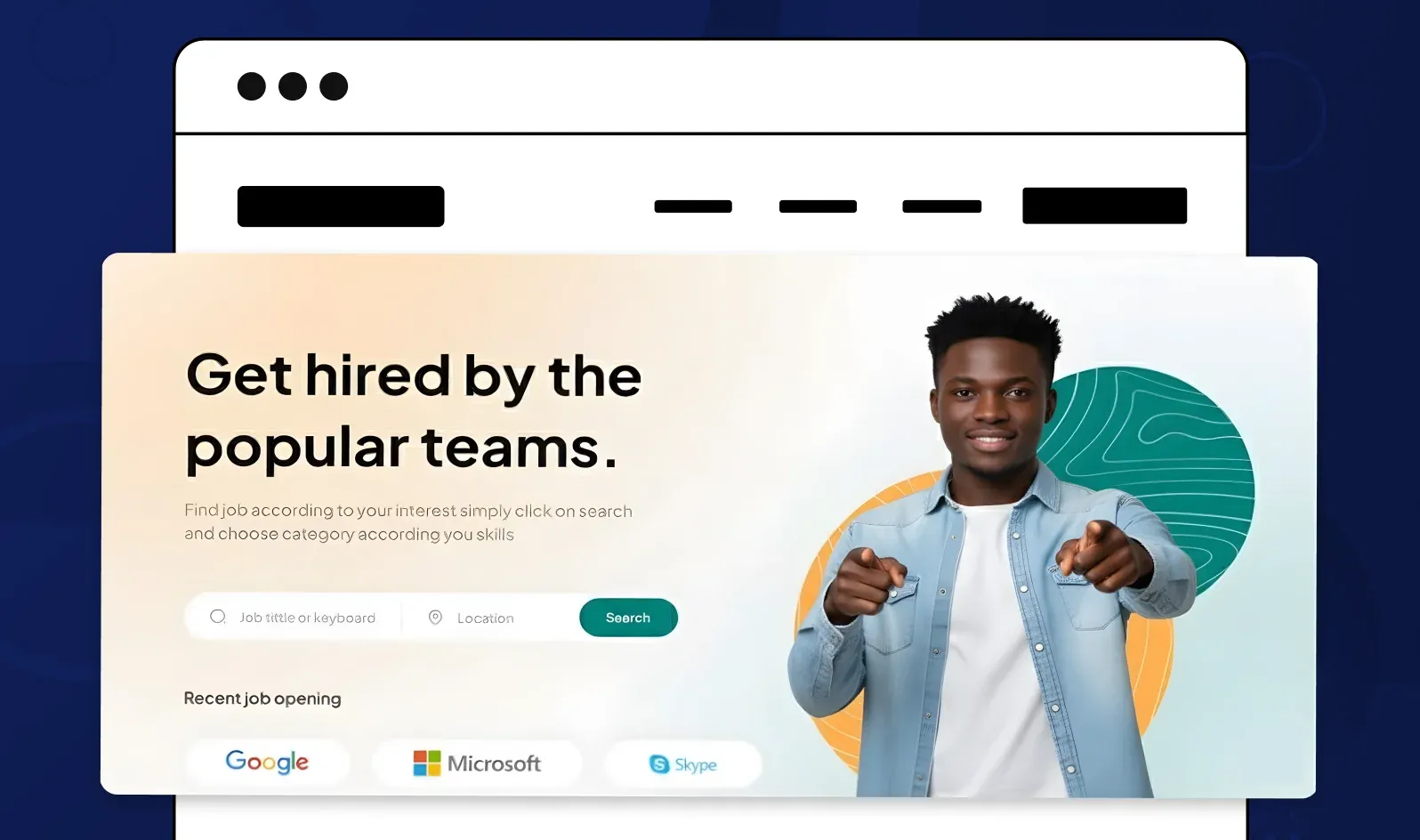
Clean layouts with tons of whitespace, a single product photo, and a bold sans-serif headline. Think Apple's homepage aesthetic — simple, confident, focused.
Design prompt for Phot.ai: "Create a minimalist hero banner with white background, centered product image, bold headline 'Innovation Simplified,' and subtle CTA button."
2. Gradient Overlay Banners
Full-bleed background images with a colored gradient overlay (e.g., blue to purple or orange to pink). This adds depth and makes text pop.
Design prompt: "Homepage banner with mountain landscape photo, purple-to-blue gradient overlay at 60% opacity, white headline text 'Adventure Awaits,' CTA 'Explore Now.'"
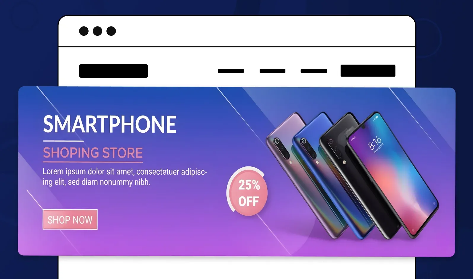
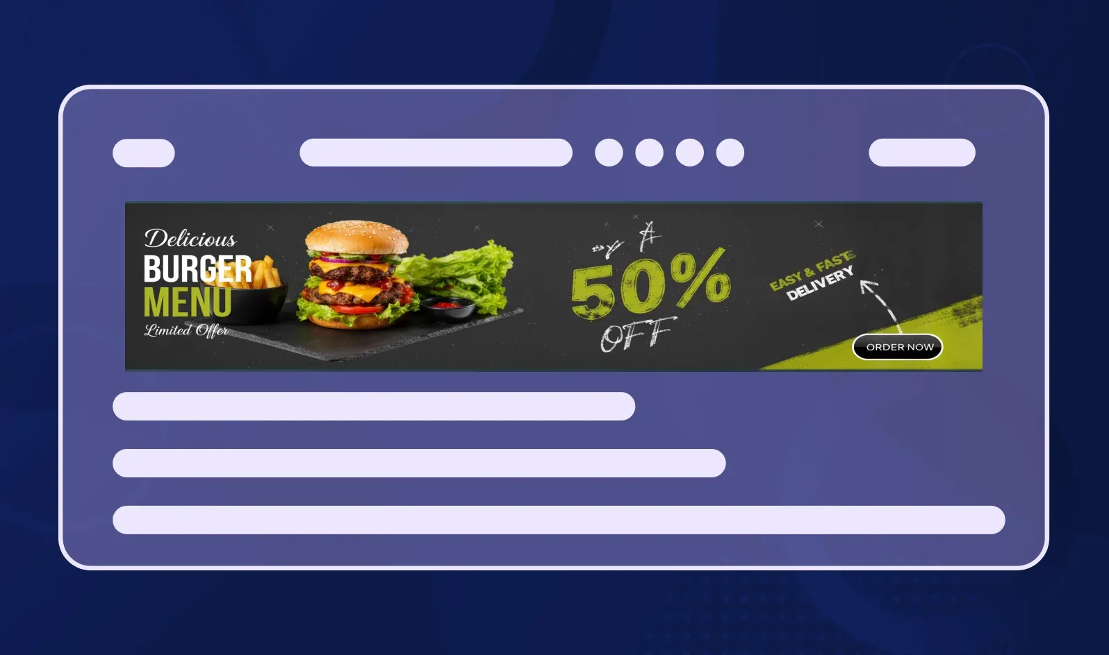
3. Product-Focused Banners
Let your product be the hero. Crisp, high-res product photos on a neutral background with minimal text.
Design prompt: "E-commerce banner featuring sneaker product photo on light gray background, headline 'Limited Edition Drop,' and 'Shop Now' CTA in brand red."
Social Media Banners
Facebook Cover Ideas (820×312 px)

-
Brand story banners with team photos or behind-the-scenes content
-
Event announcements with date, time, and registration CTA
-
Customer testimonial highlights with quotes and faces
Twitter Header Ideas (1500×500 px)
-
Brand manifesto banners with mission statement and logo
-
Product showcase grids displaying multiple items
-
Campaign-specific headers for launches or promotions
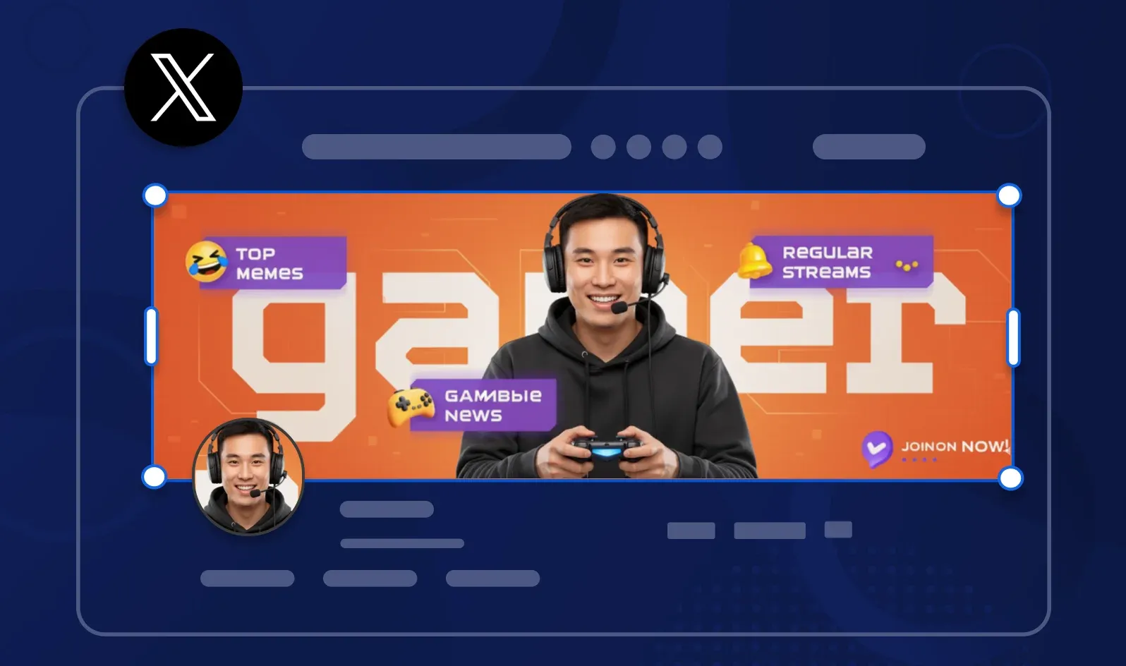
LinkedIn Banner Ideas (1584×396 px)
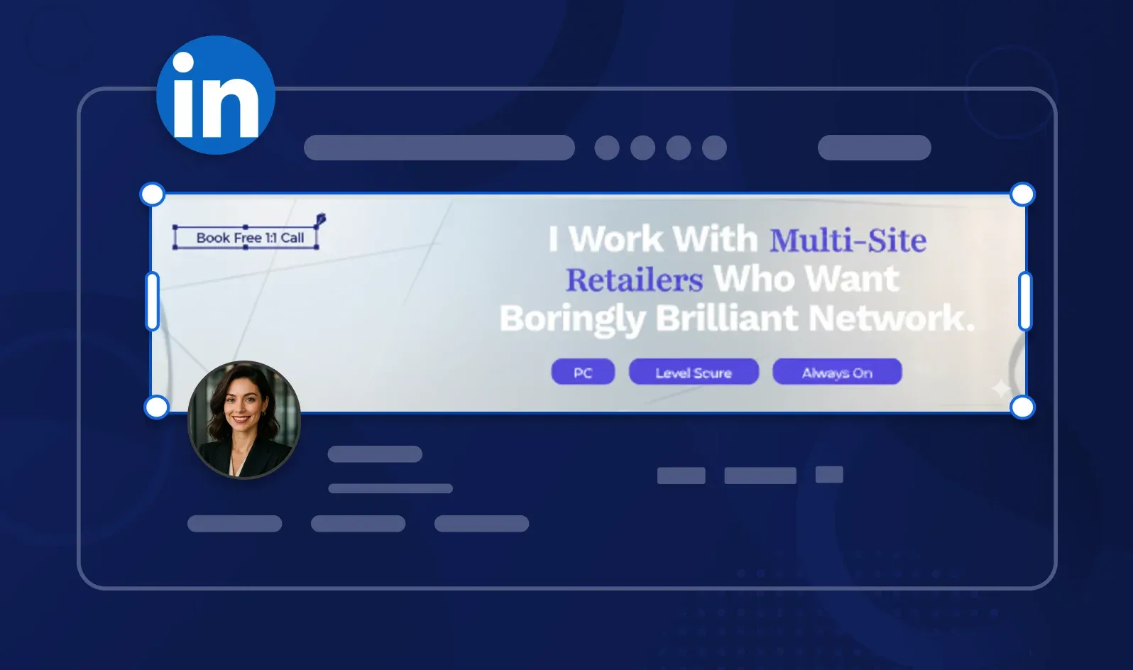
-
Professional achievement banners (awards, certifications)
-
Team culture photos with company tagline
-
Thought leadership banners with key stat or quote
E-commerce and Ad Banners
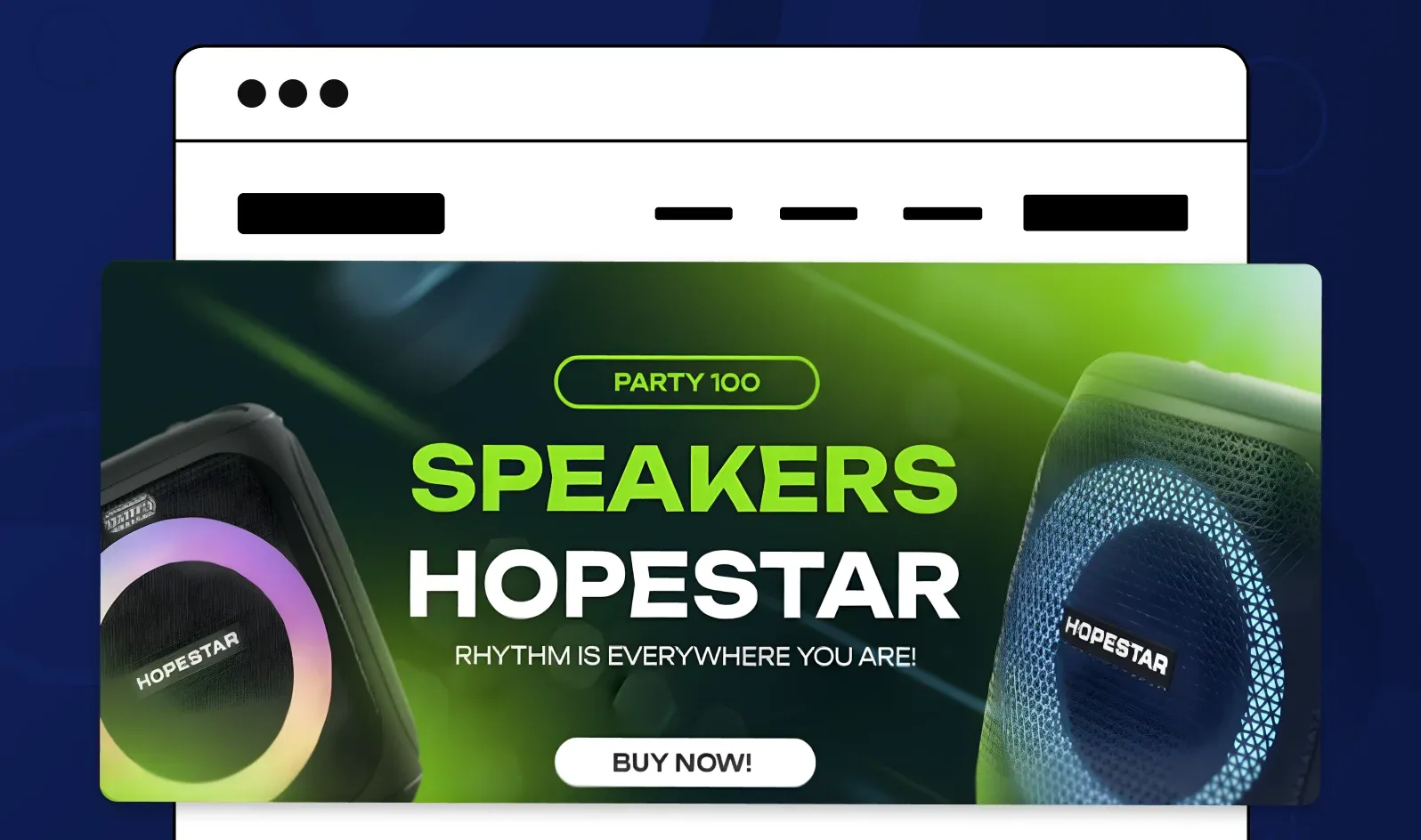
Sale or Product Launch Banners
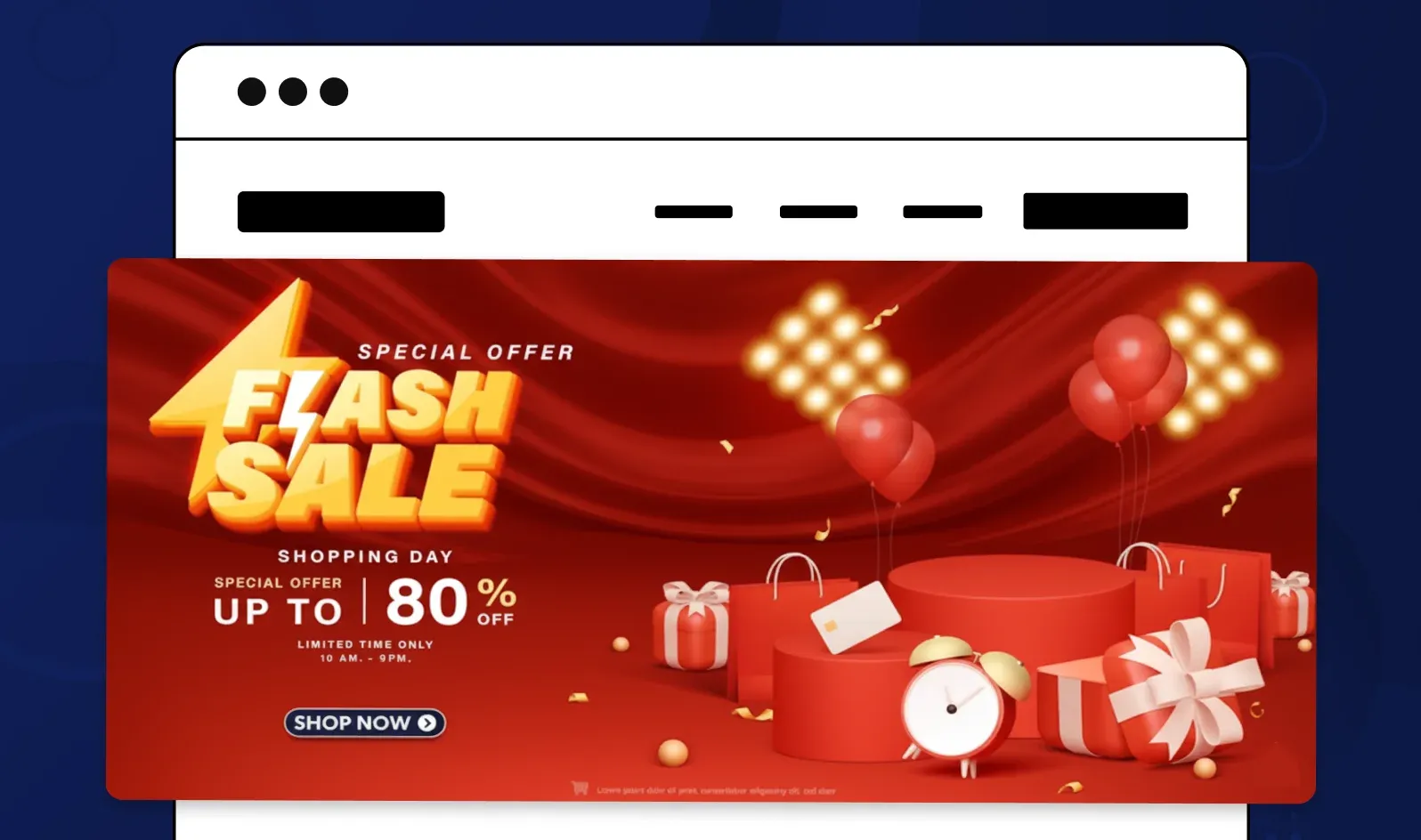
High contrast, urgency-driven designs with clear discount percentages or "New Arrival" tags.
Design prompt: "Promotional web banner with bold red background, yellow burst graphic, '50% OFF' in huge white text, product photo, and countdown timer."
Animated Web Banners for Retargeting
Subtle motion catches attention in busy feeds. Try gentle fades, sliding text, or product rotation animations.
Design prompt: "Animated leaderboard banner (728×90) with product sliding in from left, headline fading in, and CTA button pulsing gently."
Seasonal or Event-Specific Banners
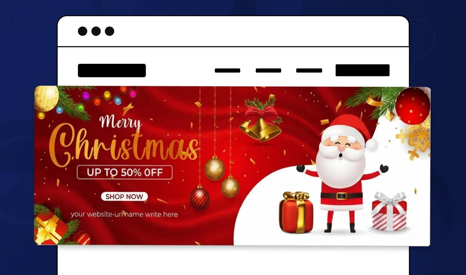
Tie your banner to holidays, seasons, or cultural moments. Christmas, Black Friday, back-to-school — these themes boost relevance.
Design prompt: "Holiday banner with winter theme, snowflake graphics, cozy product photography, headline 'Warm Up Your Winter,' CTA 'Shop the Collection.'"
The beauty of Phot.ai is that it turns these prompts into actual designs in seconds. You're not starting from scratch or hunting for stock assets — the AI understands the concept and builds it for you.
Common Mistakes to Avoid
Even experienced designers fall into these traps. Here's what I see most often — and how Phot.ai helps you avoid them.
1. Overcrowded Layouts
The mistake: Trying to fit five messages, three images, and seven CTA buttons into one banner.
The fix: One visual idea. One message. One action. If you can't explain your banner in five words, simplify it.
How Phot.ai helps: The AI flags when layouts feel cluttered and suggests removing or repositioning elements for better visual flow.
2. Too Much Text or No CTA
The mistake: Either writing a paragraph on your banner (nobody reads it) or forgetting the CTA entirely (what do you want users to do?).
The fix: Headline: 5-8 words max. Subheadline (optional): 10 words max. CTA: 2-3 words ("Shop Now," "Learn More").
How Phot.ai helps: Templates come with pre-optimized text hierarchies, so you're guided toward brevity.
3. Ignoring Responsive Sizing
The mistake: Designing only for desktop, then discovering your banner is unreadable on mobile.
The fix: Design mobile-first or create separate versions for different screen sizes.
How Phot.ai helps: Automatically adjusts aspect ratios and suggests mobile-optimized layouts. You can preview how your banner looks on phone, tablet, and desktop before exporting.
4. Poor Contrast or Legibility
The mistake: Light gray text on white background. Yellow text on orange. Text over busy photo backgrounds with no overlay.
The fix: Use contrast-checking tools or add semi-transparent overlays behind text.
How Phot.ai helps: The AI detects contrast issues and warns you when text might be hard to read. It suggests darker overlays or alternate color schemes automatically.
5. Unbranded Imagery
The mistake: Using generic stock photos that could belong to any company.
The fix: Use your actual products, team photos, or custom illustrations. If using stock, customize it heavily with your brand colors and filters.
How Phot.ai helps: Once you upload your brand assets (logo, colors, fonts), the platform remembers them and applies your branding consistently across all banners.
How AI Is Changing Banner Design Forever
Let's be honest: banner design used to be tedious. Manual resizing for 12 different ad formats. Hours in Photoshop tweaking alignment. Hiring freelancers and waiting days for revisions.
AI has flipped the script.
Here's what I've experienced since integrating AI tools like Phot.ai into my workflow:
AI generates layout, color, and hierarchy instantly. You describe what you want, and the platform builds it — no template hunting, no manual grid alignment.
No need for manual resizing. Create one hero banner design, and Phot.ai auto-adapts it to every format you need: leaderboard (728×90), mobile (320×100), social (1500×500). Same design, optimized for each platform.
Built-in image enhancer ensures print-level clarity. Upscale low-res images, remove backgrounds, adjust lighting — all without leaving the banner builder.
A/B testing banners visually in seconds. Generate 5 color variations, 3 CTA options, or 2 layout styles and see them side-by-side before publishing.
Here's my take:
"In 2025, the best banner designers won't be those who spend hours in Photoshop — they'll be the ones who use AI tools like Phot.ai to test, iterate, and win faster."
The creative edge isn't about technical skill anymore. It's about speed, testing velocity, and knowing what converts. AI handles the execution; you bring the strategy.
Conclusion: From Idea to Impact in Minutes
Web banners aren't just decorative — they're digital billboards that sell, inspire, and convert. Whether you're building a homepage hero, launching a display ad campaign, or refreshing your social media headers, the difference between amateur and professional often comes down to design execution and speed.
With Phot.ai, anyone can create professional, high-converting banners in minutes — no design degree required, no expensive software subscriptions, no waiting on freelancers.
You get:
-
AI-powered templates for every banner type and platform
-
Automatic resizing and format optimization
-
Built-in brand consistency tools
-
Instant background removal and image enhancement
-
Mobile-first responsive previews
Start your first banner now. Open Phot.ai's AI Banner Generator, choose your goal (website header, social banner, or display ad), and create a beautiful, conversion-ready banner in under 5 minutes.
Try Phot.ai Free — No credit card required. No learning curve. Just great banners, fast.
Have questions about web banner design or want to share your Phot.ai creations? Drop a comment below — I'd love to see what you build!
Frequently Asked Questions
What is the standard size for web banners?
The standard web banner sizes vary by type and placement. For homepage hero banners, use 1920×1080 pixels. For display ads, common sizes include Leaderboard (728×90), Medium Rectangle (300×250), Wide Skyscraper (160×600), and Large Mobile Banner (320×100). Social media banners have different dimensions: Facebook Cover (820×312), Twitter Header (1500×500), and LinkedIn Banner (1584×396).
How do I make a professional web banner without design experience?
You can create professional web banners using AI-powered tools like Phot.ai. Simply define your goal, select a smart template optimized for your platform, upload your brand elements (logo, product photos), customize the visuals with colors and text, and export in the right format. The AI provides real-time feedback on readability, contrast, and mobile optimization, ensuring your banner is conversion-ready in minutes.
What makes a web banner effective?
An effective web banner has clarity over clutter (one clear message), strong visual hierarchy (headline → image → CTA), appropriate color psychology for your brand, 20-30% whitespace for readability, mobile optimization with text size 16px minimum, and a clear call-to-action. The banner should communicate its message in under 2 seconds and be optimized for both desktop and mobile viewing.
What are the most common web banner design mistakes?
The most common mistakes include overcrowded layouts with too many messages, excessive text or missing CTAs, ignoring mobile responsive sizing, poor contrast making text hard to read, and using generic unbranded stock imagery. To avoid these, focus on one visual idea per banner, keep headlines to 5-8 words, design mobile-first, ensure proper text-background contrast, and use your actual products or branded visuals.
Can I create banners for free?
Yes, you can use our AI Banner Generator for free and then upgrade for more!
Phot.AI Team
Creative Intelligence Platform