8 Basic Graphic Design Principles to Create Stunning Visuals with Phot.AI
Unlock the secrets to creating eye-catching designs by mastering these fundamental graphic design principles with Phot.AI.
Table of Contents
- Introduction
- 1. Focus on Alignment
- 2. Leverage Hierarchy to Guide Focus
- 3. Use Contrast to Highlight Key Elements
- 4. Repetition for Consistency
- 5. Consider Proximity to Organize Information
- 6. Maintain Balance in Your Designs
- 7. Optimize Color to Evoke Emotion
- 8. Leave Negative Space
- Conclusion
Introduction
Graphic design plays a vital role in creating compelling visuals that capture attention, convey messages, and help brands stand out. Whether you’re designing for print, digital ads, social media, or website content, understanding the principles of graphic design can significantly improve the quality of your designs. At Phot.AI, we provide powerful tools that help you harness these principles to create stunning graphics in minutes. Here are the eight fundamental design principles that every designer should follow to create professional, visually appealing graphics.
1. Focus on Alignment

Alignment is one of the most important graphic design principles. It ensures that your design elements are visually connected and organized. Proper alignment creates a clean, orderly layout that guides the viewer's eye naturally from one element to the next. Whether you’re designing for web content or social media posts, Phot.AI can help you align your graphics seamlessly with ease.
Pro Tip: Use Phot.AI’s AI-powered alignment tools to position elements with precision and create visually balanced compositions.
2. Leverage Hierarchy to Guide Focus
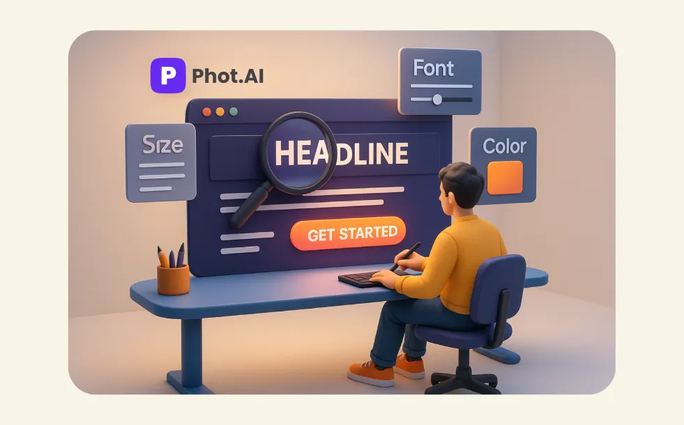
Hierarchy helps emphasize the most important elements in your design. By using varying font sizes, color contrasts, and positioning, you can direct the viewer’s focus to the most critical message or product. With Phot.AI, you can instantly create a design that highlights key elements, ensuring your message stands out.
Pro Tip: Customize font styles, sizes, and colors with Phot.AI to create clear visual hierarchy and effective call-to-action buttons.
3. Use Contrast to Highlight Key Elements
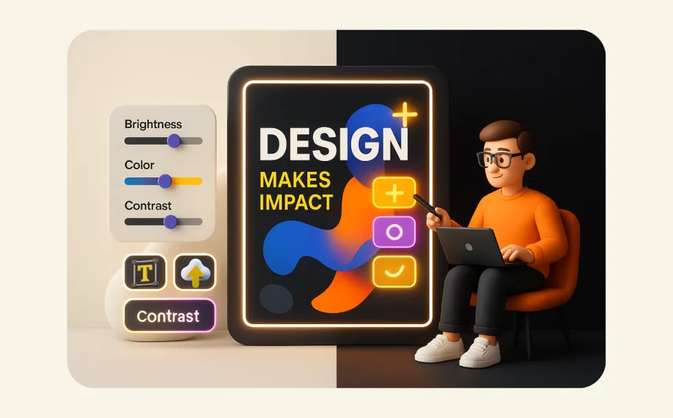
Contrast is a powerful tool that makes design elements pop. By pairing light and dark colors, bold fonts with lighter text, or geometric shapes with organic forms, you can create visual interest and draw attention to specific areas of your design. Phot.AI’s tools make it easy to adjust colors and contrast to create visually impactful designs.
Pro Tip: Experiment with Phot.AI’s built-in contrast-enhancing filters to make your designs stand out and capture your audience’s attention.
4. Repetition for Consistency
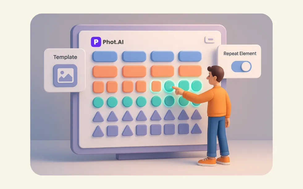
Repetition is a key graphic design rule that helps unify your design. By repeating colors, shapes, or patterns, you create a cohesive and consistent look across all elements of your design. Phot.AI allows you to apply repetitive visual elements across your graphics, ensuring a consistent brand identity in all your designs.
Pro Tip: Use Phot.AI’s templates to maintain consistency across multiple designs, keeping your branding intact and visually strong.
5. Consider Proximity to Organize Information
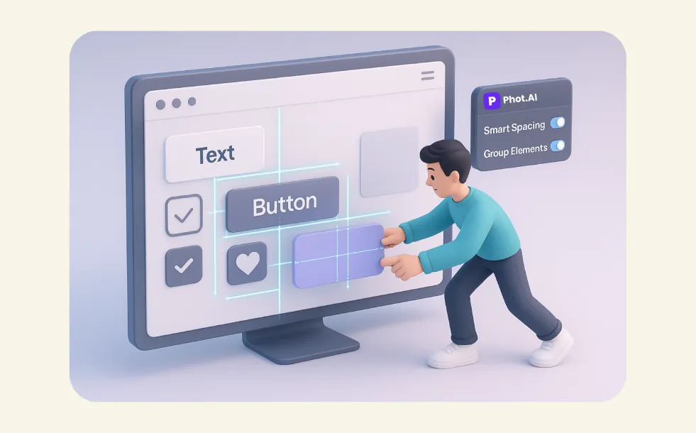
Proximity helps to organize elements that are related to each other. Grouping similar items together allows your audience to easily understand relationships and navigate your content. Phot.AI’s intuitive design interface makes it easy to adjust the spacing between design elements, helping you create organized and effective layouts.
Pro Tip: Take advantage of Phot.AI’s smart spacing tools to automatically group and align related items within your design.
6. Maintain Balance in Your Designs

Balance ensures that your design feels stable and harmonious. It doesn’t mean that every element needs to be the same size or placed symmetrically. Symmetrical or asymmetrical balance, when done correctly, helps guide the viewer’s eye evenly across your design. Phot.AI allows you to experiment with different types of balance to achieve the most visually appealing design.
Pro Tip: Use Phot.AI’s AI-assisted balance tools to distribute elements evenly, creating a harmonious composition for your visuals.
7. Optimize Color to Evoke Emotion
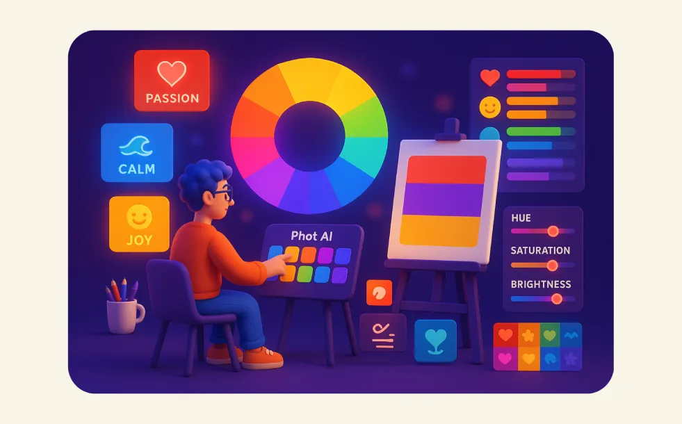
Color is more than just aesthetic; it has psychological effects and can influence how people feel and respond to your content. By understanding color theory, you can choose hues that resonate emotionally with your audience. Phot.AI offers a wide range of color palettes, so you can experiment with different combinations to ensure your designs communicate the right message.
Pro Tip: Leverage Phot.AI’s color palette generator to find the perfect combination for your brand’s design needs, ensuring emotional resonance with your audience.
8. Leave Negative Space

Negative space, or white space, is just as important as the elements you choose to fill your design. It helps to create breathing room around your content, making it easier for viewers to focus on key information. By effectively using negative space, you can avoid clutter and give your design a clean, professional look. Phot.AI allows you to manipulate and create ample space between elements, making sure your designs feel balanced and clear.
Pro Tip: Use Phot.AI’s layout tools to adjust negative space automatically and create designs that feel open and not overwhelming.
Conclusion
Mastering these eight basic graphic design principles will take your visuals to the next level. Whether you're designing for print, digital advertising, or social media, these principles will help you create designs that captivate and engage your audience. With Phot.AI, you have the power of AI-driven design tools at your fingertips, making it easier than ever to create beautiful and professional graphics in no time.
By incorporating these principles into your designs, you’ll be able to create stunning visuals that leave a lasting impression, strengthen your brand, and elevate your marketing efforts.
Start using Phot.AI today to create graphics that wow!